

Best Contractor for Home Addition Projects: How to Find One
June 7, 2026
When Is the Best Time to Paint a House in Shreveport?
August 7, 2026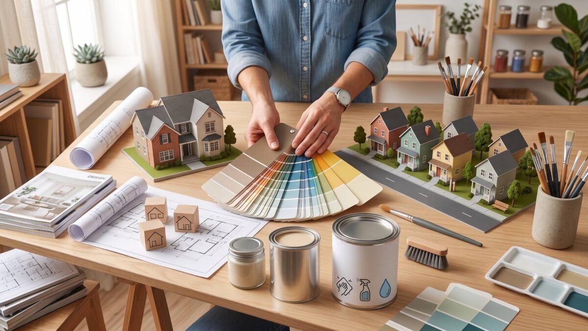
Home Painting Color Ideas to Refresh Your Shreveport Home
Your Guide to Hiring a Trusted Local Roofing Professional
Refreshing your home does not always require a large renovation. In many cases, a new paint color can completely change how your living space feels while giving your home a more updated appearance. Whether you are brightening a single room or planning to repaint the entire house, choosing the right color involves more than selecting a shade that looks appealing on a sample card.
As painting professionals, we encourage you to think about how color interacts with your home's lighting, layout, and existing finishes. A thoughtful color palette can make smaller rooms feel more open, highlight architectural details, and create a comfortable atmosphere that reflects your personal style. Every home has its own character, so the best results come from selecting colors that complement those unique features rather than simply following trends. With that in mind, understanding the basics of color selection is the first step toward creating a home that feels refreshed inside and out.
How Paint Color Can Transform Your Space
Before comparing paint samples, it helps to understand how color influences the overall feel of your home. Paint affects more than appearance. It shapes the mood of each room, changes how light is reflected, and works alongside permanent features such as flooring, cabinetry, and trim. Looking at these elements together helps you make decisions that remain appealing long after the project is complete.
The Impact of Color on Mood
Every color creates a different atmosphere. Warm shades, such as soft beige, creamy white, and light terracotta, often make gathering spaces feel welcoming and comfortable. In contrast, cooler tones like muted blue and sage green tend to create a more relaxing environment, making them popular choices for bedrooms and bathrooms.
Neutral colors continue to be a favorite because they provide flexibility. As your furniture or décor changes over time, neutral walls allow those updates to blend naturally without requiring another complete repaint. These responses to color are closely related to the principles of color psychology, which explore how different hues can influence emotions and perceptions.
How Lighting Affects Paint Colors
Lighting has a significant influence on how paint appears once it is applied. A color that looks warm in the store may appear cooler inside your home depending on the direction of natural light and the type of artificial lighting used in the evening.
For that reason, we recommend viewing paint samples throughout the day before making a final decision. This simple step gives you a better understanding of how the color will look under changing conditions. If you're still deciding between several shades, using a paint color visualizer to preview different options on your walls or upload a photo of your space can help you compare colors before painting
Considering Existing Home Features
Paint should complement the features that already define your home. Flooring, countertops, cabinetry, fireplaces, and brick accents all contribute to the overall design, so selecting colors that coordinate with these elements creates a more balanced appearance.
The home's architectural style also deserves consideration. For example, a historic home near Fairfield Avenue may suit a different palette than a contemporary home in Provenance, allowing each property to maintain its own character while still feeling refreshed.
Interior Home Painting Color Ideas
Once you have a better understanding of how color complements your home, you can start narrowing your options based on each room’s purpose. Instead of selecting colors one room at a time, we recommend choosing a cohesive palette that creates a natural flow throughout your home while still giving each space its own distinct character.
Bright Neutrals for a Timeless Look
Soft white, warm cream, and light greige remain popular because they suit a wide variety of interior styles. These colors reflect natural light, helping rooms feel brighter and more spacious while providing a clean backdrop for furniture and decorative pieces.
They are particularly effective in open floor plans, where maintaining visual continuity helps adjoining spaces feel connected instead of separated.
Warm Earth Tones for Comfortable Living Spaces
Earth-inspired colors such as taupe, sand, and muted clay introduce warmth without making a room feel heavy. They pair naturally with wood flooring, stone accents, and traditional furnishings, making them a practical choice for living rooms, dining areas, and entryways.
These colors create a comfortable atmosphere that remains appealing, even as design trends change.
Soft Blues and Greens for Relaxation
Bedrooms and bathrooms often benefit from colors that encourage a sense of calm. Soft blue reflects light beautifully, while muted green brings a subtle touch of nature without overwhelming the space.
When paired with simple furnishings and natural textures, these colors help create spaces that feel peaceful and comfortable for everyday use.
Bold Accent Colors Without Overwhelming the Room
Introducing a stronger color does not mean every wall needs to be painted in a dramatic shade. Instead, bold colors work best when used to highlight architectural features such as built-in shelving, fireplaces, or a single feature wall.
Deep navy, forest green, and charcoal can provide contrast while allowing the surrounding neutral palette to maintain balance.
Modern Dark Colors for Sophisticated Interiors
Darker colors have become increasingly popular in contemporary interiors because they add depth and highlight architectural details. Dark gray, deep green, and rich navy work especially well in home offices, dining rooms, or spaces with abundant natural light.
Rather than making the room feel smaller, these colors create visual interest when balanced with lighter trim, flooring, or furnishings. Used thoughtfully, they can give an interior a refined appearance without overwhelming the space.
Exterior Home Painting Color Ideas
While interior paint focuses on comfort and function, exterior colors influence how your home blends with its surroundings. We encourage you to think about the property's architectural style, existing materials, and landscaping before making a decision. A coordinated exterior palette helps your home look well-maintained while preserving its unique character.
Classic White Homes with Dark Trim
A white exterior paired with dark trim remains a timeless combination because it highlights architectural details without appearing overly decorative. Window frames, columns, and rooflines become more defined, creating a clean and balanced appearance.
This color scheme also complements a variety of landscaping styles, making it a practical choice for homes near Cross Lake or in established neighborhoods where mature trees and gardens contribute to the property's overall appeal.
Soft Gray Exteriors
Gray offers a versatile alternative for homeowners who want a neutral color with added depth. Depending on its undertones, gray can feel warm and welcoming or clean and contemporary. It also pairs well with brick, stone, and natural wood features that are common on many homes throughout the area.
Before selecting a shade, we recommend testing samples on different sides of your home since sunlight can noticeably change how gray appears throughout the day.
Earth-Inspired Exterior Colors
Natural colors such as sandstone, sage, olive, and warm beige create a welcoming appearance while blending comfortably with outdoor surroundings. These palettes work especially well for homes with stone accents, wood features, or mature landscaping because they complement existing materials rather than compete with them.
Homes in neighborhoods like Broadmoor often benefit from these understated color combinations, which respect the home's character while providing an updated look.
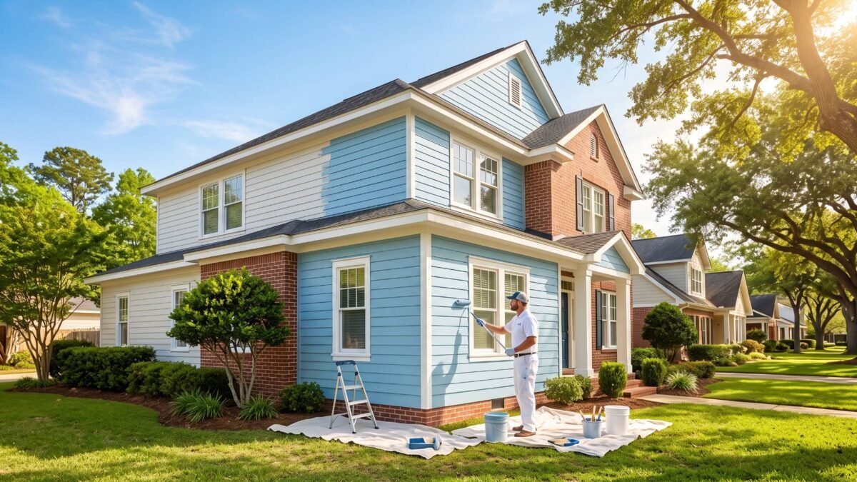
Blue Exterior Homes
Muted blue shades continue to grow in popularity because they add personality without becoming overwhelming. Blue-gray and slate blue offer enough color to distinguish a home while remaining easy to coordinate with white trim, natural wood doors, and black hardware.
Choosing a softer shade instead of a brighter blue helps create a timeless look that remains appropriate as design preferences evolve.
Rich Dark Exterior Colors
Dark gray, deep green, and black have become popular choices for homeowners seeking a more contemporary appearance. These colors often work best when balanced with lighter trim or natural materials that prevent the exterior from feeling too heavy.
Because darker paint absorbs more sunlight, proper preparation and quality products become even more important for maintaining a consistent finish over time.
Choosing Paint Colors by Room
Each room serves a different purpose, so choosing colors that reflect how the space is used often creates a more functional and cohesive home than using the same color throughout.
Living Room
Living rooms benefit from colors that encourage conversation and relaxation. Warm neutrals or soft earth tones create a comfortable setting while allowing furniture, artwork, and decorative accents to become the focal points.
Kitchen
Kitchens often feel brighter with warm whites, light grays, or muted greens. These colors coordinate well with cabinets, countertops, and backsplashes while keeping the room feeling clean and inviting.
Bedrooms
Bedrooms are ideal for softer palettes that encourage rest. Muted blue, sage green, and warm greige create a calm atmosphere without making the room feel overly formal.
Bathrooms
Light colors help smaller bathrooms feel more open while reflecting available light. Pairing these shades with moisture-resistant finishes supports both appearance and long-term performance.
Home Office
A productive workspace benefits from colors that encourage focus rather than distraction. Soft green, blue-gray, and balanced neutral tones create a comfortable environment for working, reading, or studying.
Color Trends That Work Well in Northwest Louisiana
Paint trends continue to change, but lasting color choices usually reflect both the local environment and the home's architecture. Rather than selecting colors simply because they are popular, we encourage you to consider whether they will continue to suit your home for years to come.
Warm whites, greige, and mushroom tones remain popular because they complement both traditional and contemporary homes. Nature-inspired greens also remain a popular choice, adding subtle color to both interior and exterior spaces.
For homeowners who prefer stronger contrast, deep navy and forest green provide depth without overpowering the overall design. Meanwhile, softer white shades are often preferred over bright white because they create a warmer, more comfortable appearance.
Throughout the region, from Downtown to neighborhoods such as Southern Hills, these balanced color palettes complement a variety of architectural styles while remaining timeless.
Factors to Consider Before Choosing Paint Colors
Choosing a paint color involves more than selecting a shade you like. We encourage you to consider several practical factors that can influence both the final appearance and your long-term satisfaction with the results.
First, consider your home's architectural style. Choosing colors that complement its design helps create a cohesive appearance that remains appealing beyond changing trends.
Next, think about the surrounding neighborhood. Personal style is important, but it's also worth considering how your color choices complement nearby homes to help preserve the neighborhood's overall character.
Finally, remember that paint finish is just as important as color. Flat finishes reduce surface imperfections, while satin and semi-gloss finishes are generally easier to clean and better suited for areas exposed to moisture or frequent use. Selecting the right combination of color and finish helps ensure your investment continues to look its best.
Refreshing Your Home with Confidence
A fresh coat of paint can transform both the appearance and atmosphere of your home when the colors are chosen thoughtfully. By considering lighting, room function, architectural style, and existing materials, you can create spaces that feel balanced, comfortable, and suited to your lifestyle.
Across Shreveport, homes vary in style, from historic properties near Highland to newer developments in Provenance. Taking the time to test paint samples and choose a cohesive color palette helps ensure your selections complement your home's unique features while creating a refreshed, lasting appearance.
If you're ready to update your home's interior or exterior, Sunbelt Contractors can help you choose colors that suit your home and provide a professional, long-lasting finish. To learn more about our residential painting services or schedule a consultation in Shreveport and the surrounding areas, give us a call at (318) 667-1182.